Predict Wine quality with data analytics (Part 1)
February 8, 2020
Objective
I finished 2019 with a nice project for a client in the wine industry. I wanted materials linked to wine to popularize how Data and Analytics could help business gain more value.
In the perspective of how we could use analytics for his business, I point up a case widely known in the data science community using analytics to predict wine quality. The case is about predicting the quality of the Vinho Verde wine based on various psychochemical tests only.
Vinho Verde is exclusively produced in the demarcated region of Vinho Verde in northwestern Portugal, it is only produced from the indigenous grape varieties of the region, preserving its typicity of aromas and flavors. From there we will plan Data strategy based on Company data for business perspectives: Real time (Sales Dashboarding, KPI, ROI), Next best buy, upsell, Customer experience, campaign, …
This report is a quick and dirty analysis to prepare a presentation.
Materials
I download data from UC Irvine Machine Learning Repository!
Irvine currently maintain 488 data sets as a service to the machine learning community. You may view all data sets through searchable interface.
The dataset is related to the white variants of the Portuguese Vinho Verde wine. Due to privacy and logistic issues, only physicochemical (inputs) and sensory (the output) variables are available (e.g. there is no data about grape types, wine brand, wine selling price, etc.). The data contains quality ratings for a few thousands of wines (4898 white wine samples), along with their physical and chemical properties (11 predictors). We want to use these properties to predict a rating for a wine.
The description of this dataset can be obtained from the UCI website.
I am copying it here:
. Input variables (based on physicochemical tests):
1 - fixed acidity
2 - volatile acidity
3 - citric acid
4 - residual sugar
5 - chlorides
6 - free sulfur dioxide
7 - total sulfur dioxide
8 - density
9 - pH
10 - sulphates
11 - alcohol
. Output variable (based on sensory data):
12 - quality (score between 0 and 10)
This case study was addressed by different models, where wine quality is modeled in a continuous scale, from 0 (very bad) to 10 (excellent). In second time wine quality was set to binary reponse for machine learning models.
It seems that the dataset is very clean, with no missing data and clear structure. All variables are numeric. The range of independent variables varies greatly, so when building the model I will normalize them to be within the same range.
My initial thoughts and hypothesis
My main point of interest in this dataset is the ‘quality’. I would like to determine which factors determine the quality of a wine.Without analyzing the data, I think with my knowledge in wine that maybe the alcohol, acidity(fixed, volatile or citric) will change the quality of wine based on their values. Also pH as related to acidity may have some effect on the quality. Also this would be an interesting thing to see how the pH is affected by the different acids present in the wine and if the overall pH affects the quality of the wine.
library("rvest")
library("dplyr")
library("foreach")
library("rlang")

data_wine_white = read.table("https://archive.ics.uci.edu/ml/machine-learning-databases/wine-quality/winequality-white.csv",
                       header=T,sep=";",na.strings="NA")
library(inspectdf)
library(ISLR)
library(DataExplorer)
library("viridisLite")
#library("viridis")
library('versions')
library("data.table")
library("stringr")
library("ggplot2")
library("rmarkdown")
library("pander")
library("knitr")
library("caret")
library("tidyr")
library("gridExtra")
library("grid")
require("VIF")
require("cvTools")
require("marmap")
library("htmltools")
library("vembedr")
Exploratory Data Analysis (EDA)
Exploratory Data Analysis(EDA) plays a very important role in the entire Data Science Workflow. In fact, this takes most of the time of the Data science Workflow. EDA is for seeing what the data can tell us beyond the formal modeling or hypothesis testing task.
Snapshot
How do the data look like.
library(DT)
datatable(data_wine_white, options = list(pageLength = 10))
Let’s Remove the Duplicate Rows which are not neccesary here.
library(DT)
data_wine_white <- data_wine_white[!duplicated(data_wine_white), ]
One of the amazing datascience tool for EDA wich summaryse all my following lines is this: It’s quick, powerful,interactive,… but the aim here is to explore the data step by step.
print('library(ExPanDaR);ExPanD(data_wine_white)')## [1] "library(ExPanDaR);ExPanD(data_wine_white)"Let us start with a snapshot view of our dataset.
plot_intro(data_wine_white)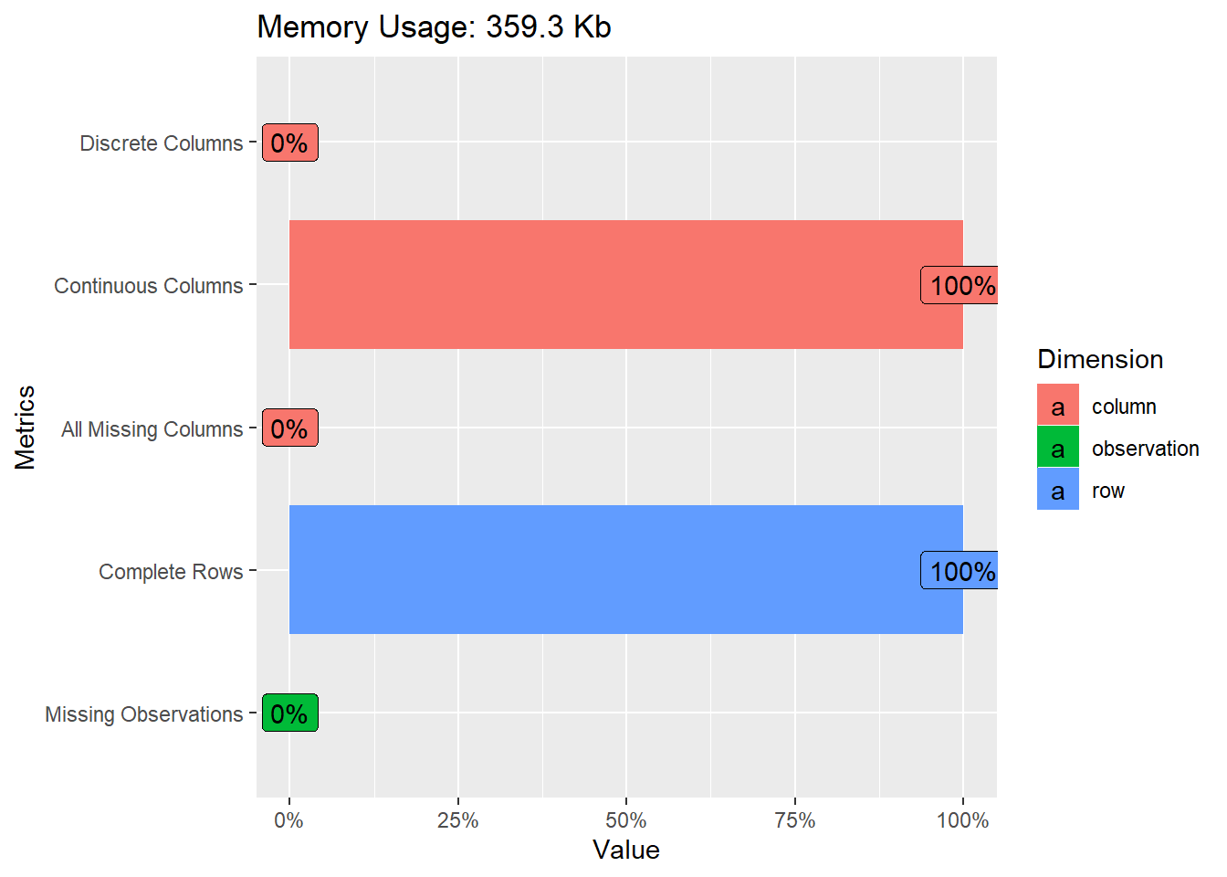
That give us a quick overview of the missing variables, discrete columns, continuous columns.
Fortunately here we have 100% of complete Rows.
Let’s see the level of the wine quality, the target reponse here.
library("ggplot2")
library("ggpubr")
theme_set(theme_pubr())


df <- data_wine_white %>%
  group_by(quality) %>%
  summarise(counts = n())

ggplot(df, aes(x =reorder(quality, counts), y = counts)) +
  geom_bar(fill = "#0073C2FF", stat = "identity") +
  geom_text(aes(label = counts), vjust = -0.3) +
  theme_pubclean()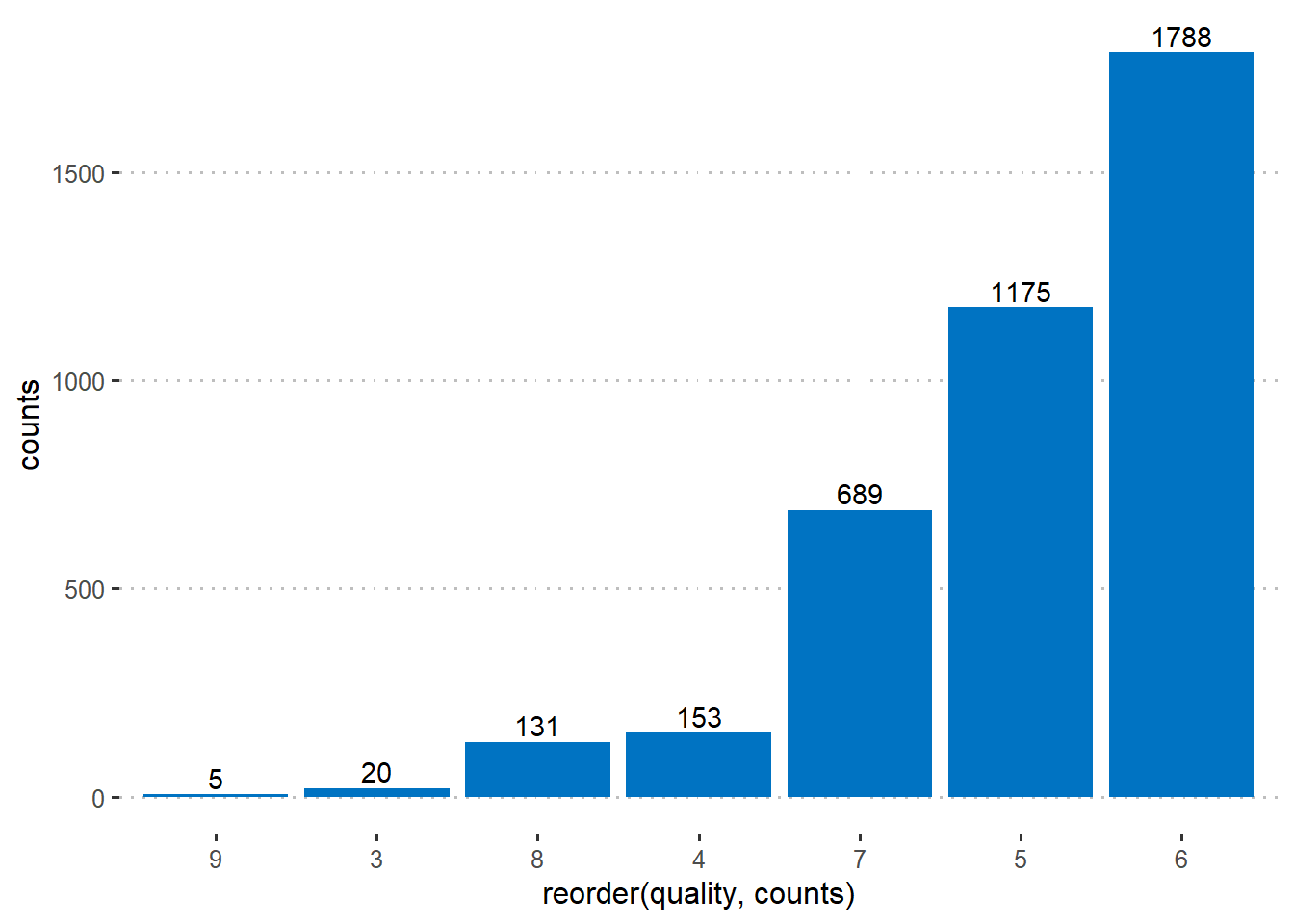
df <- df %>%
  arrange(desc(quality)) %>%
  mutate(prop = round(counts*100/sum(counts), 1),
         lab.ypos = cumsum(prop) - 0.5*prop,
         quality=as.factor(quality))


ggplot(df, aes(x = "", y = prop, fill = quality)) +
  geom_bar(width = 1, stat = "identity", color = "white") +
  geom_text(aes(y = lab.ypos, label = prop), color = "white")+
  coord_polar("y", start = 0)+
  ggpubr::fill_palette("jco")+
  theme_void()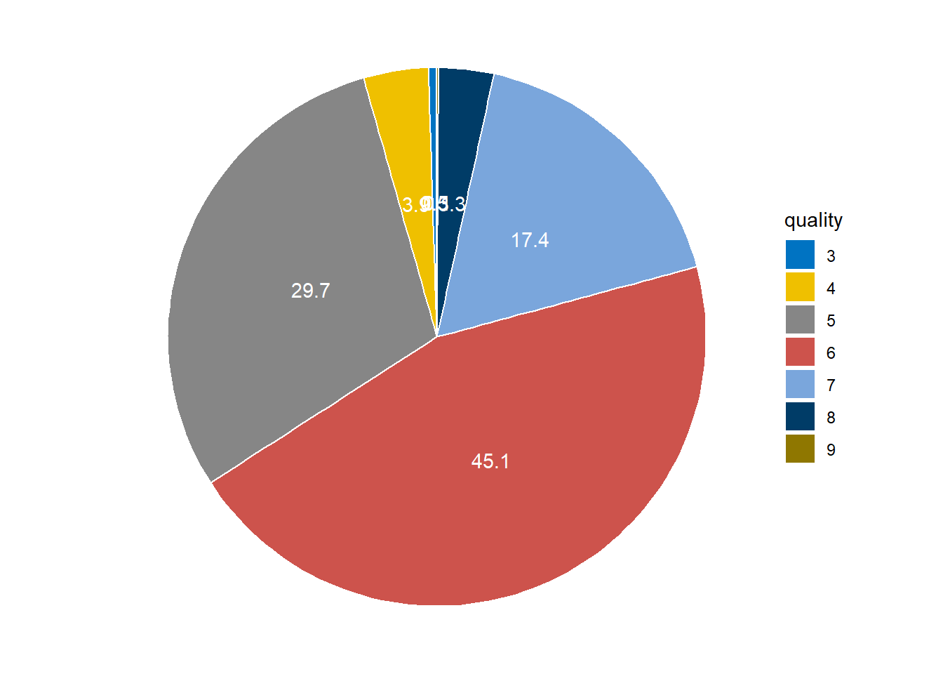
So the variable quality of the wine vary from 3 to 9 and we can see the proportion of each response as well.
Histogram of Continuous Variables
And how do the other variables look like?
plot_histogram(data_wine_white)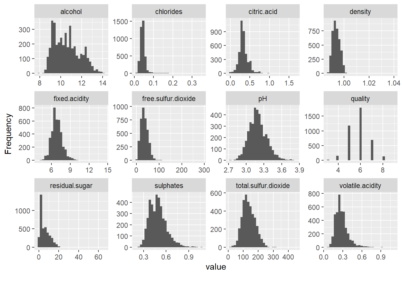
The same plots but with Density plot.
plot_density(data_wine_white)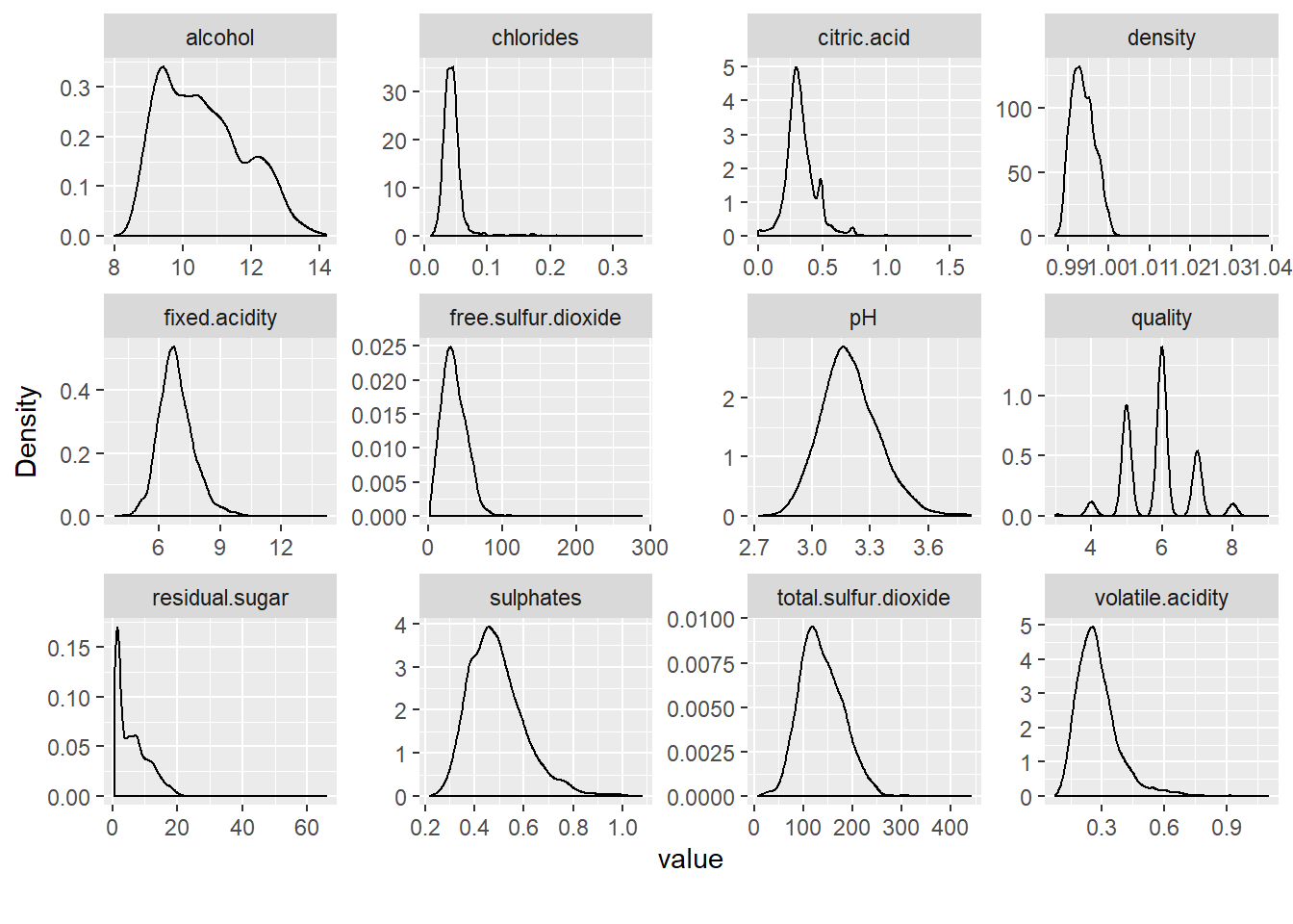
Time for some Categorical Variables - Barplots!
Let’s look about the boxplots by the dependent variable (quality of the wine).
plot_boxplot(data_wine_white, by = "quality") 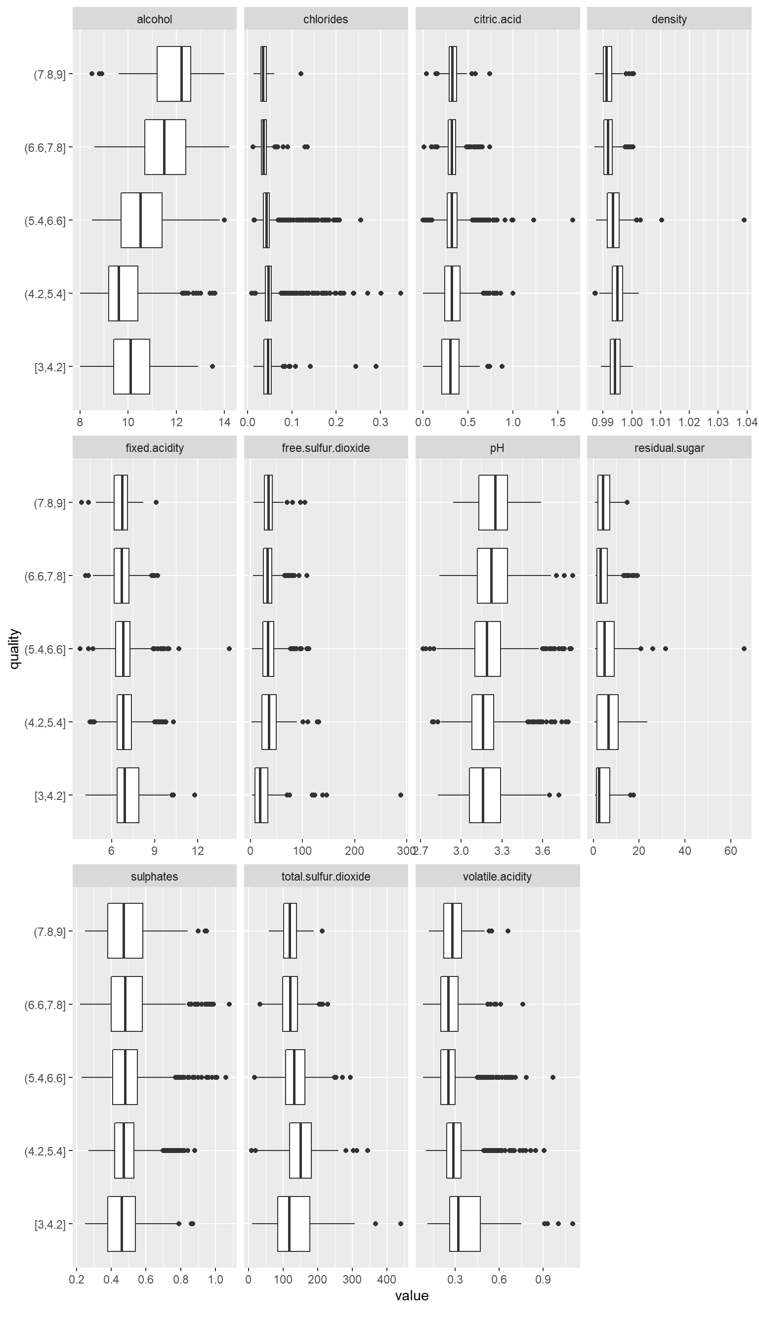
More visualisations to have ideas about our data.
library(rbokeh)
figure() %>%
  ly_points(pH, alcohol, data = data_wine_white,
            color = quality, glyph = quality,
            hover = list(pH, alcohol))
Multivariate Analysis
Correlation Analysis
Starting with Correlation analysis.
library("caTools")
library("corrplot")
corrplot(cor(data_wine_white))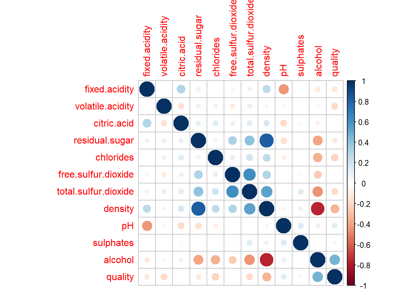
More concrete correlation with value of the correlation.
library("plyr")
plot_correlation(data_wine_white, cor_args = list( 'use' = 'complete.obs'))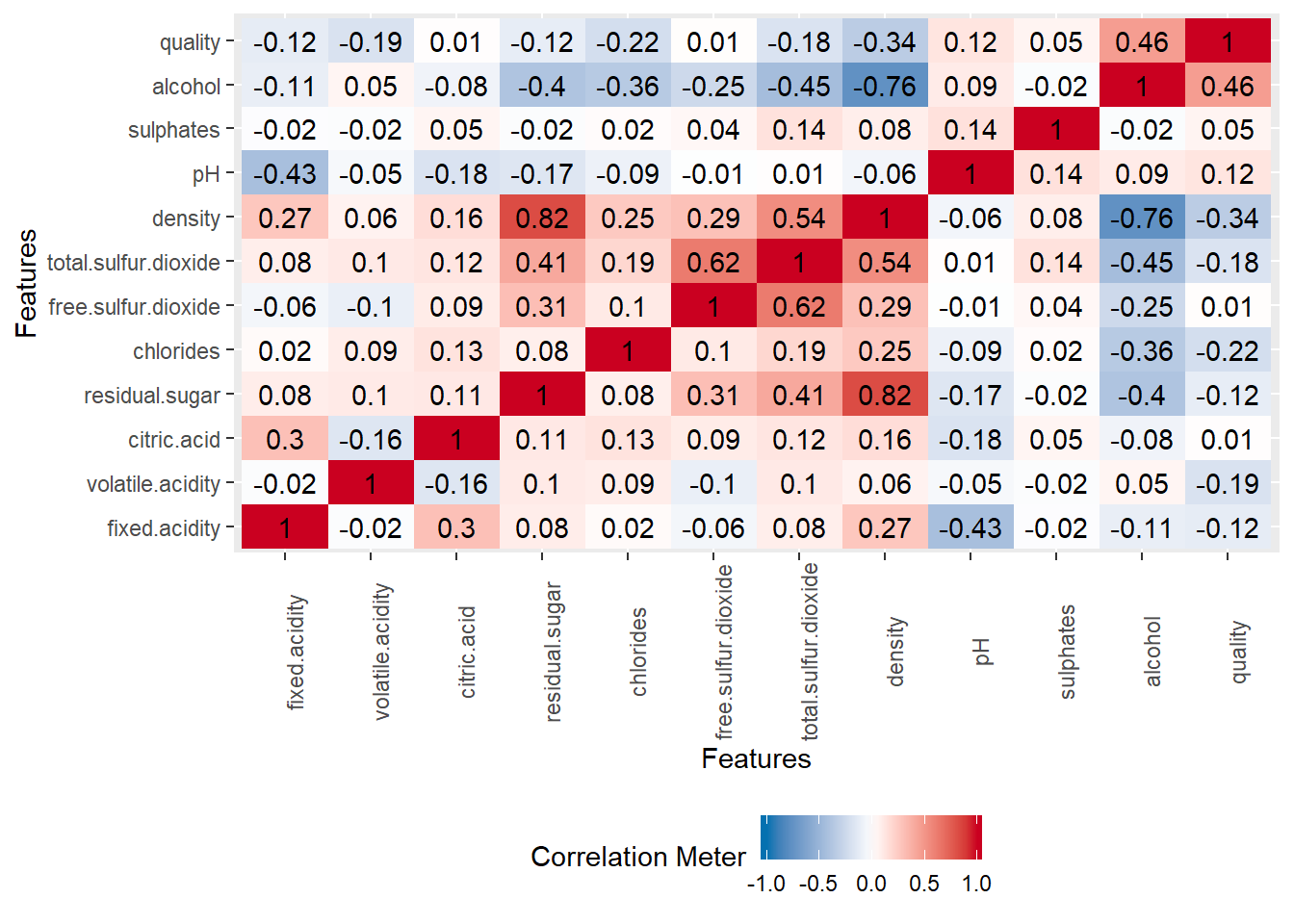
So what do we conclude with a quick view of the data ?
Sugar,pH and citric acid factors are not playing a really big role in the quality of wine. But density, alcohol, total sulfure.dioxide are kind of strongly correlated to the quality of wine.
Skewness
Let’s Check the skewness of the individual variables of the data to see whether the data is normally distributed or not.
library("robustbase")
attach(data_wine_white)
Intuitively, the skewness is a measure of symmetry. As a rule, negative skewness indicates that the mean of the data values is less than the median, and the data distribution is left-skewed. Positive skewness would indicate that the mean of the data values is larger than the median, and the data distribution is right-skewed.
As a general rule of thumb: If skewness is less than -1 or greater than 1, the distribution is highly skewed.
If skewness is between -0.5 and 0.5, the distribution is approximately symmetric.
library(broom)
skewness_asisit<-tidy(data_wine_white)
skewness_wine_white<-skewness_asisit%>%
  select(column, mean, skew)
print(skewness_wine_white)
## # A tibble: 12 x 3
## column mean skew
## <chr> <dbl> <dbl>
## 1 fixed.acidity 6.84 0.696
## 2 volatile.acidity 0.281 1.64
## 3 citric.acid 0.334 1.31
## 4 residual.sugar 5.91 1.33
## 5 chlorides 0.0459 4.97
## 6 free.sulfur.dioxide 34.9 1.57
## 7 total.sulfur.dioxide 137. 0.457
## 8 density 0.994 1.27
## 9 pH 3.20 0.455
## 10 sulphates 0.490 0.937
## 11 alcohol 10.6 0.451
## 12 quality 5.85 0.112We can see that our distribution is highly skewed (we already saw it in the plot dsitribution previously), so we need a transformation to have them normaly transformed.
detach(data_wine_white)Data Transformation / Preparation
There are many existing transformations but let’s use a basic one’s the Boxcox transformation. We will transform the data and then again check the skewness.
library("caret")
preprocess_wine_white <- preProcess(data_wine_white[,1:11], c("BoxCox", "center", "scale"))
new_wine_white <- data.frame(trans = predict(preprocess_wine_white, data_wine_white))
Skewness - Transformed Data
let’s get a look on our transformed data.
library(broom)
skewness<-tidy(new_wine_white)
skewness_new_wine_white<-skewness%>%
  select(column, skew)
print(skewness_new_wine_white)
## # A tibble: 12 x 2
## column skew
## <chr> <dbl>
## 1 trans.fixed.acidity 0.113
## 2 trans.volatile.acidity 0.172
## 3 trans.citric.acid 1.31
## 4 trans.residual.sugar -0.0583
## 5 trans.chlorides -0.150
## 6 trans.free.sulfur.dioxide 0.0951
## 7 trans.total.sulfur.dioxide 0.00893
## 8 trans.density 1.10
## 9 trans.pH 0.000288
## 10 trans.sulphates -0.0187
## 11 trans.alcohol 0.0393
## 12 trans.quality 0.112We get it!!!
Removal of Outliers
Let’s remove the outliers. There are pleitor of existing rules to delete outliers.
The following rule is applied:
A predictor value is considered to be an outlier only if it is greater than SD - 3. The rationale behind this rule is that the extreme outliers are all on the higher end of the values and the distributions are all positively skewed.
Many other rules can be applied.
new_wine_white <- new_wine_white[!abs(new_wine_white$trans.fixed.acidity) > 3,]
new_wine_white <- new_wine_white[!abs(new_wine_white$trans.volatile.acidity) > 3,]
new_wine_white <- new_wine_white[!abs(new_wine_white$trans.citric.acid) > 3,]
new_wine_white <- new_wine_white[!abs(new_wine_white$trans.residual.sugar) > 3,]
new_wine_white <- new_wine_white[!abs(new_wine_white$trans.chlorides) > 3,]
new_wine_white <- new_wine_white[!abs(new_wine_white$trans.density) > 3,]
new_wine_white <- new_wine_white[!abs(new_wine_white$trans.pH) > 3,]
new_wine_white <- new_wine_white[!abs(new_wine_white$trans.sulphates) > 3,]
new_wine_white <- new_wine_white[!abs(new_wine_white$trans.alcohol) > 3,]
We now check the correlation matrix, confidence interval with the help of corrplot package. It also helps us to do matrix reordering.
plot_correlation(new_wine_white, cor_args = list( 'use' = 'complete.obs'))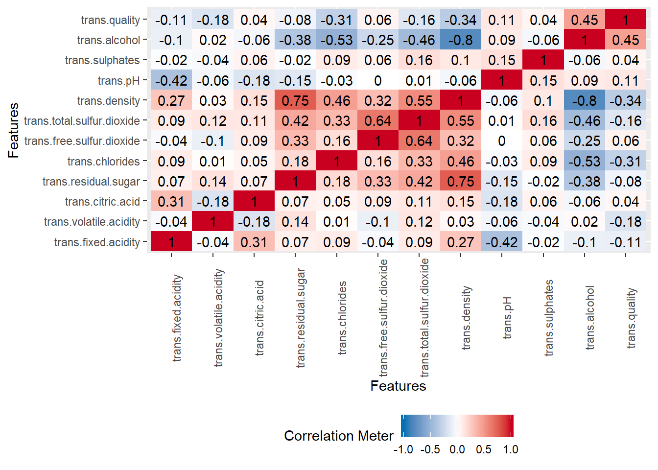
We see again the correlation between alcool and the target response.
Let’s now start with the modeling part (Part II ).
Data Analytics, QueleAnalytics↩